


How Artists Use Color and Light to Create Emotion in Art

A painting can feel cheerful before you recognize a single object in it. Another can feel lonely even if the subject is simple, like a road, a room, or a face turned away. That first emotional hit is not an accident. Artists shape it through color, light, line, texture, and composition.
Mood is one of art’s clearest languages. Bright yellow can feel like sunlight. Deep navy can feel like night. A soft lavender wash can quiet the mind, while a slash of hot pink beside orange can feel loud and restless. These choices guide the viewer before the story of the artwork fully appears.
The same subject can change completely depending on those choices. A cat by a window might feel playful in candy colors, peaceful in misty blue light, or nostalgic under a warm lamp at dusk. That is the power of visual mood: it turns what we see into something we feel.

Mood begins with the first color impression
Color is often the first emotional signal in a work of art, playing a crucial role in how viewers perceive and connect with the piece. The initial reaction to a painting or sculpture is frequently dictated by the colors employed, which can evoke a wide range of feelings and associations. Before the eye comprehends the subject matter or the narrative being presented, it instinctively responds to the palette chosen by the artist. This immediate emotional response can set the tone for the entire experience of the artwork, influencing how the audience interprets the themes and messages conveyed. Artists harness the power of color through three main qualities to shape that response: hue, saturation, and value.
Hue
Hue refers to the specific color itself, such as red, blue, or yellow. Each hue carries its own emotional weight and cultural significance, which can vary widely across different contexts. For instance, warm hues like red and orange are often associated with feelings of passion, energy, and warmth, while cool hues such as blue and green may evoke calmness, tranquility, or sadness. The choice of hue can also create a sense of harmony or contrast within a composition, guiding the viewer's eye and influencing their emotional journey through the artwork. Artists may choose to emphasize certain hues to highlight particular elements or to create a desired atmosphere, thereby enhancing the overall impact of the piece.
Saturation
Saturation, also known as chroma, refers to the intensity or purity of a color. A highly saturated color appears vivid and striking, capturing attention and eliciting strong emotional reactions. In contrast, a desaturated color, which is more muted or grayish, may convey subtlety, sophistication, or melancholy. Artists manipulate saturation to evoke different emotional responses; for example, the use of bright, saturated colors can create a sense of joy and exuberance, while softer, desaturated tones may evoke nostalgia or introspection. The interplay of saturation within a work can guide the viewer’s emotional experience, drawing them into the narrative or theme being explored.
Value
Value refers to the lightness or darkness of a color, which plays a vital role in creating depth, contrast, and dimension within a composition. The manipulation of value can significantly affect the mood of a piece; lighter values may convey a sense of hope, openness, or serenity, while darker values can evoke feelings of mystery, drama, or foreboding. Artists often use a range of values to create focal points, enhance visual interest, and establish a sense of space. By skillfully balancing light and dark, artists can guide the viewer’s emotional response and create a more immersive experience that resonates on a deeper level.
In conclusion, the emotional language of color in art is complex and multifaceted. By thoughtfully considering hue, saturation, and value, artists can craft powerful visual narratives that resonate with viewers long after they have left the gallery. Understanding these qualities not only enhances our appreciation of art but also deepens our emotional engagement with the works we encounter.
Light-hearted art feels open, playful, and safe
Happy, whimsical art often uses bright, sunny colors that feel light in both tone and mood. Yellow, pink, sky blue, peach, mint, and soft green appear often because they suggest warmth, sweetness, spring air, candy, toys, flowers, and open skies.
The shapes in this kind of art also tend to feel friendly. Rounded forms, soft curves, smiling faces, floating objects, and small surprises make the artwork feel safe rather than threatening. A dragon with huge eyes and tiny wings feels charming. The same dragon with sharp angles, black scales, and red backlight feels dangerous.
Artists creating this mood often lean into:
Rounded lines and bouncy shapes
High-key color, meaning mostly light values
Clear daylight or soft glowing light
Funny details, magical creatures, or unexpected scenes
Open space that lets the image breathe
A whimsical painting of a moon wearing a hat or a tiny fox riding a teacup does not need realism to work. Its emotional truth comes from play. The viewer understands the mood because every visual choice says, “This world is safe enough to enjoy.”
Dark art creates weight through shadow and muted color
Moody, dark, and heavy art works in the opposite direction. Instead of openness, it uses limited light. Instead of high color, it often uses muted tones: deep black, navy, charcoal gray, muddy green, wine red, or brown. These colors absorb attention instead of bouncing it back.
Low light makes the viewer search. That search can create mystery, unease, sadness, or deep focus. A portrait with half the face in shadow feels private. A lonely house under storm clouds feels tense. A figure standing in a wide, dark field can carry a sense of silence that words would weaken.
Texture can add even more weight. Thick paint, rough brushwork, scratched surfaces, and layered pigment give the canvas a physical heaviness. The viewer does not only see the heaviness. They almost feel it.
This style often appears in subjects such as:
Lonely landscapes
Serious portraits
Stormy skies
Empty rooms
Figures turned away from the viewer
Darkness does not always mean fear. It can also suggest depth, grief, reflection, or dignity. The key is control. A skilled artist does not simply make everything black. They decide where the light survives.

Light tells the viewer where emotion lives
Light does more than reveal objects. It tells the viewer what matters and how to feel about it. A spotlight can make a face feel dramatic. A candle can make a room feel intimate. Misty dawn light can make a lake feel sacred and still.
Artists shape mood by choosing the direction, strength, color, and softness of light. Hard light creates sharp shadows and tension. Soft light smooths edges and slows the eye. Warm light can feel close and human. Cool light can feel distant, clean, or quiet.
Peaceful art uses soft light and quiet edges
Serene and peaceful art is built around stillness. The goal is often to slow the viewer’s breathing. Artists create that calm by reducing harsh contrast and avoiding visual noise.
A peaceful palette might include sage green, pale lavender, misty gray, soft sky blue, sand, ivory, or warm white. These colors do not shout. They sit gently beside each other. The transitions between them are usually smooth, so the eye glides rather than jumps.
Brushwork matters here. Smooth, blended strokes can create a glassy surface that seems almost unbroken. A lake at dawn, a silent forest in fog, or a minimalist abstract painting with soft edges can all feel peaceful because nothing in the image feels rushed.
Common signs of serene art include:
Low contrast between light and dark
Soft, neutral palettes
Blended brushstrokes
Open space and simple compositions
Horizontal lines, which often feel stable and calm
A flat lake at sunrise works because the surface mirrors the sky. The eye moves slowly across it. There is no crash, no sharp edge, no visual interruption. The painting gives the viewer permission to pause.
Warm light makes nostalgia feel close
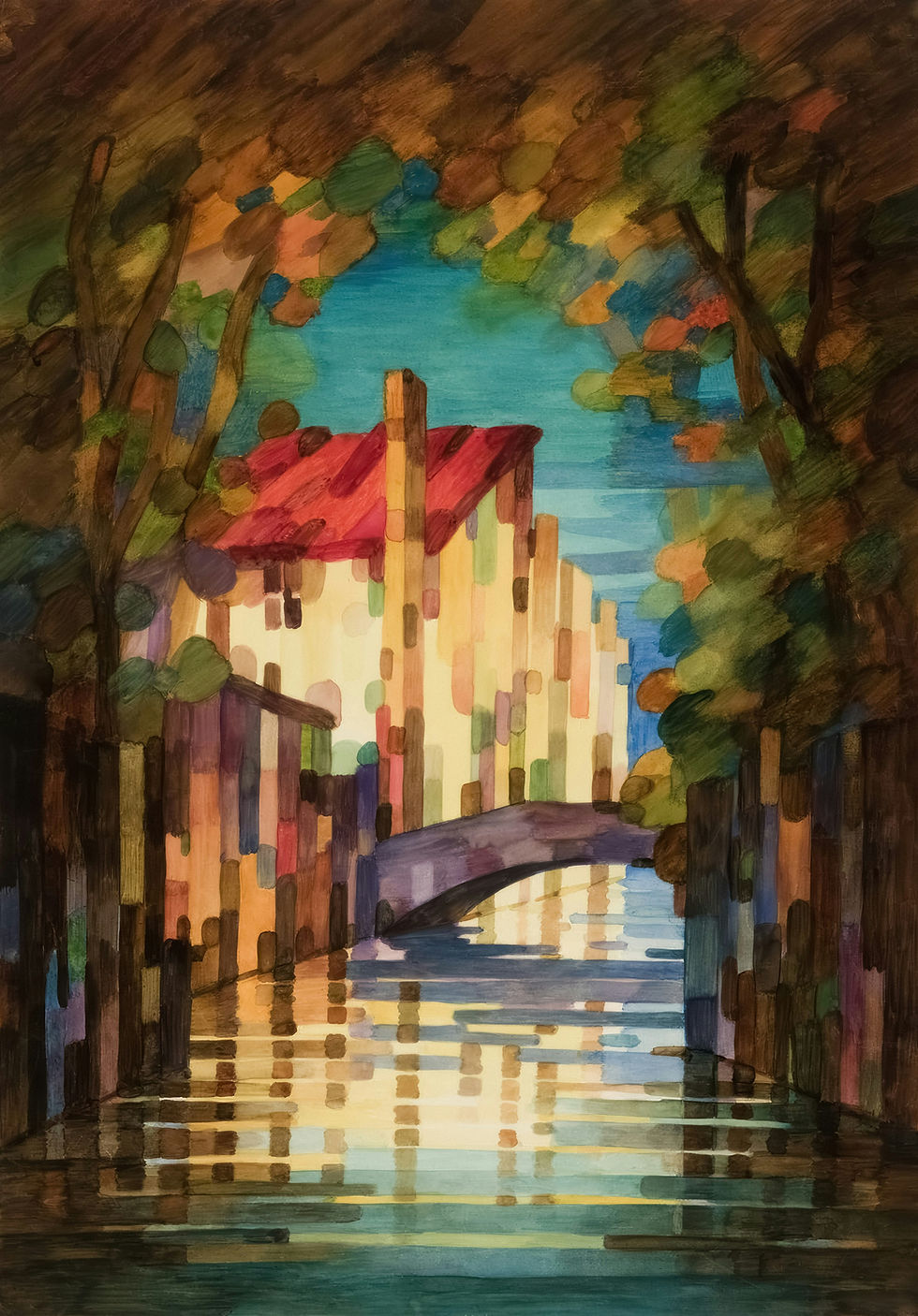
Melancholic, nostalgic, and cozy art has a more complex emotional tone. It can feel comforting and lonely at the same time. This mood often comes from warm light placed against darker surroundings.
Think of golden hour sunbeams across a floor, a candle beside a window, or a single lamp glowing in a quiet room. The light feels personal because it does not fill the whole world. It protects one small area.
Artists often use earth tones for this feeling: amber, rust, ocher, burnt orange, warm brown, cream, and deep red. These colors suggest leaves, old wood, brick, wool blankets, tea, and late afternoon. They feel lived-in.
Subjects that carry this mood well include:
A sleeping pet by a sunlit window
An old brick building framed by autumn leaves
A person reading in a soft armchair
A rainy window with a small lamp nearby
A kitchen at dusk after everyone has left
This mood works because it holds two feelings at once. The warm light comforts the viewer. The surrounding shadow reminds them that the moment is passing.
Lines, shapes, and edges change the emotional temperature
Color and light carry much of the mood, but they do not work alone. Lines, shapes, and edges tell the body how to respond.
Curved lines often feel gentle. Jagged lines can feel tense. Vertical lines may feel formal or still. Diagonal lines create motion because they seem to lean, fall, rise, or push forward.
Edges also matter. A hard edge makes the eye stop. A soft edge lets the eye drift. That is why peaceful art often uses blurred transitions, while energetic art uses sharp marks, splatters, and visible strokes.
High-energy art uses motion the eye can feel
Energetic art feels like movement caught in the act. It can suggest loud music, rushing water, spinning bodies, fireworks, or pure adrenaline. Artists create this effect by placing bold colors next to each other and using marks that feel fast.
Burning orange beside electric teal creates a strong visual charge. Hot pink beside deep blue can make the surface buzz. The point is not only brightness. It is contrast. Colors become more intense when they sit beside their opposites or near-opposites.
Brushwork also becomes more physical. Fast strokes, splatters, thick paint, uneven marks, and unblended colors make the image feel alive. The viewer can imagine the artist’s hand moving quickly across the canvas.
This mood often appears in:
Swirling abstract forms
Ocean waves crashing into rocks
Dancers or athletes caught mid-motion
Fire, festivals, or city lights at night
Animals running, leaping, or turning sharply
An energetic painting does not need a busy subject. Even a simple abstract work can feel charged if the colors clash, the lines move diagonally, and the brushstrokes feel immediate.
Mood | Color choices | Light choices | Line and texture choices |
Playful and happy | Yellow, pink, sky blue, mint | Bright, open, sunny | Rounded shapes, smooth curves |
Dark and heavy | Black, navy, charcoal, muted red | Low, shadowed, stormy | Thick paint, rough surfaces |
Peaceful and serene | Sage, lavender, misty gray, pale blue | Soft, even, diffused | Blended strokes, quiet edges |
Energetic and bold | Orange, teal, hot pink, strong contrast | Bright flashes or dramatic contrast | Fast strokes, splatters, diagonals |
Nostalgic and cozy | Amber, rust, warm brown, cream | Golden hour, candlelight, lamps | Soft texture, intimate detail |

Artists build feeling by controlling contrast
Contrast is one of the strongest tools for emotion. It can appear in color, light, size, texture, or subject matter. A tiny figure in a huge landscape can feel lonely. A bright doorway in a dark hallway can feel hopeful or suspenseful. A smooth face against a rough background can feel fragile.
Artists often use contrast to create a clear emotional focus. If every color is equally bright, nothing feels special. If every part of the painting is dark, the viewer has no path through the image. Mood becomes stronger when the artist decides what to emphasize and what to hold back.
A few kinds of contrast shape emotion especially well:
Light against dark
Creates drama, mystery, hope, or danger.
Warm against cool
Can make one area feel close and another feel far away.
Smooth against rough
Adds tension between calm and discomfort.
Large against small
Can suggest awe, loneliness, protection, or vulnerability.
Stillness against movement
Makes motion feel more powerful when it appears.
Imagine a painting of a lone person reading by a lamp. If the whole room is bright, the scene may feel pleasant. If the lamp becomes the only warm light in a dark room, the mood changes. It becomes intimate, quiet, and maybe a little sad. Nothing about the subject changed. The contrast changed the emotion.
The strongest emotional art feels intentional
Mood in art rarely comes from one choice. A cheerful painting is not cheerful only because it uses yellow. A peaceful painting is not peaceful only because it has blue. Artists create emotion by arranging many small signals so they point in the same direction.
A light-hearted image might combine sunny color, rounded forms, open space, and gentle humor. A dark image might combine low light, muted color, heavy texture, and a lonely subject. A nostalgic image might combine warm lamps, earth tones, soft edges, and familiar objects.
That is why emotional art can feel so immediate. The viewer may not name every visual cue, but the body reads them quickly.

The next time a piece of art catches your attention, pause before asking what it is about. Ask what it feels like first. Notice the colors, the shadows, the softness of the edges, and the direction of the light.
That first feeling is not random. It is the artist speaking through mood, using color and light as the words.
Color and light are powerful tools for creating emotion in art. Through hue, saturation, value, contrast, and texture, artists can guide the viewer’s mood and shape how a piece is experienced. Whether creating warmth, mystery, energy, or calm, thoughtful use of color and light helps transform an image into an emotional story. By paying attention to these elements, artists can create work that not only captures attention but also leaves a lasting impression.


Comments